Flavors Pizza2024
Flavors Pizza is a bold, delivery-first pizza brand built around a single conviction: pizza should taste like something. The brand identity and packaging system were built to match — loud, confident, and impossible to forget at the door.
Problem
Flavors Pizza was entering a market dominated by international chains and local shops that all looked the same. Generic fonts, generic red-and-white color blocks, generic box designs. The brand had a strong product story — bold flavors, thin crust, fast delivery — but nothing in the visual identity was telling it.
Approach
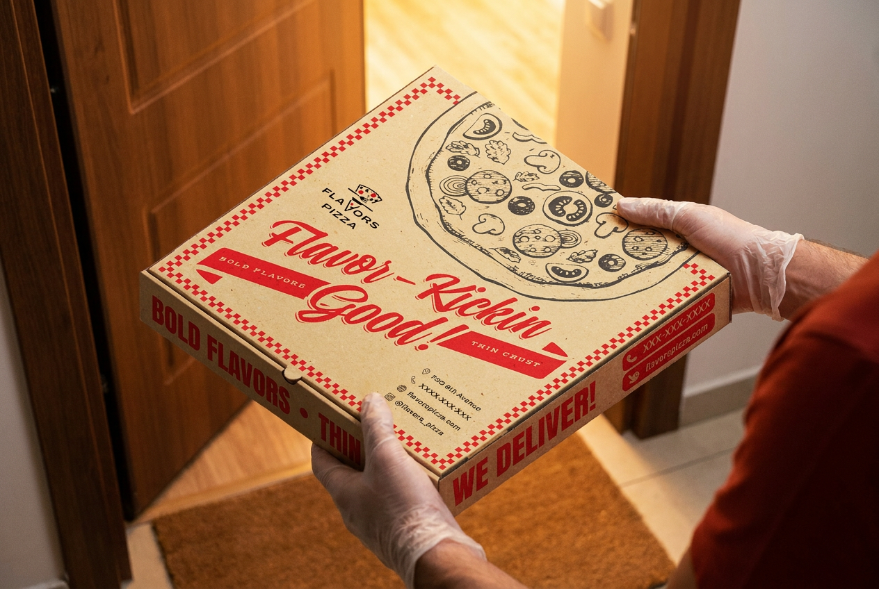
Leaned into retro Americana pizza culture: vintage script typography, hand-drawn pizza illustrations, and a red-and-kraft checkered border system that immediately read as something worth unboxing. The tagline 'Flavor-Kickin Good!' was made the hero of the packaging — displayed in a confident, hand-lettered script that stopped being copy and started being design.
System
The packaging system anchors the entire brand. A full pizza box design leads with the illustration and script hero, with supporting brand elements — logo mark, address, social handles, and a 'WE DELIVER!' callout — woven into the structure of the box itself. Every face is designed, not just the lid. The color system pairs warm kraft with deep red and white, reinforced by a checkered border motif that telegraphs the brand at a glance.
Outcome
Flavors Pizza launched with packaging that became its own marketing asset — customers photographed the box on delivery, making the unboxing moment a repeatable brand touchpoint. The retro illustration system gave the brand a visual signature strong enough to carry across future merchandise, digital, and in-store applications.